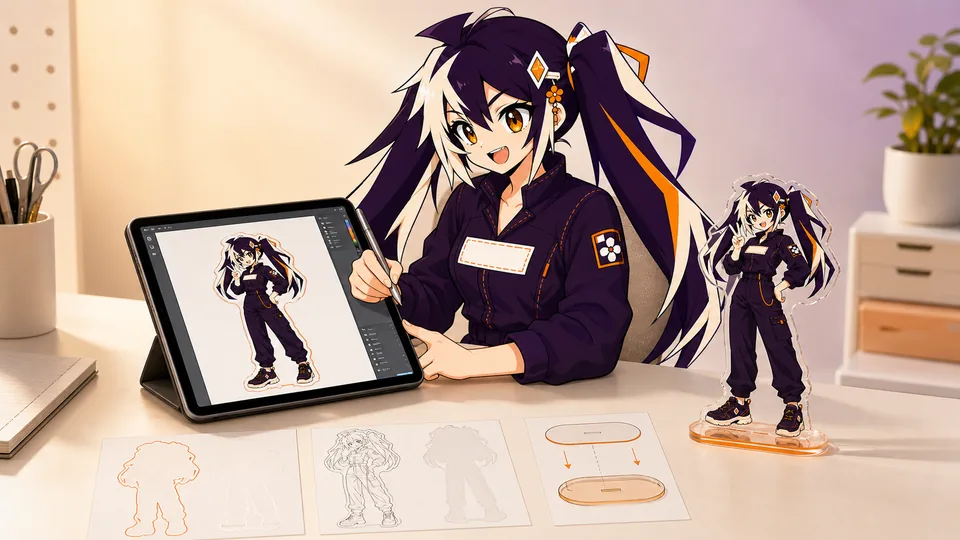
A production file is more than attractive artwork. It tells the factory how large the standee is, where it is cut, which areas print opaque, what appears on each side and how the upright connects to its base.
Supply artwork at the intended finished size, separate print and effect layers, identify the front and back, and review the upright and base together. The confirmed proof—not a screen mockup—is the final production reference.
01
Key takeaways
Use these decisions to guide the detailed checks below.
- Define upright, base and assembled dimensions separately.
- Keep print, white ink, effects and cut instructions distinguishable.
- Review front and back as a paired view of the same object.
- Keep the upright and base on the same approved template version.
- Use the production proof to close assembly questions before approval.
| File component | What it communicates | What to check |
|---|---|---|
| Print artwork | Visible design on each side | Scale, text and orientation |
| White or effect layer | Where opacity or a finish is intended | Mask alignment and transparent areas |
| Cut and tab reference | Physical outline and assembly | Version, contour and base pairing |
| Review copy | How the complete object should look | Views and dimensions agree |
02
Start with the finished size and use case
Choose the longest finished edge according to where the standee will live. The finished size includes the acrylic around the printed artwork, so do not measure only the character or logo inside it.
Keep tiny facial features, type and narrow accessories legible at real-world size. A detail that looks clear at 300% zoom may disappear from an arm’s length away.
Start with the display location. A desk display, crowded shelf and event table create different constraints on apparent scale, footprint and the angle from which the artwork will be seen. A paper upright and base outline can reveal that a composition feels too narrow or hides another item. This is an editorial layout check, not a mechanical approval of the final acrylic construction.
For a hypothetical two-character set, record whether the characters need equal height, a shared baseline or a deliberately different scale. Those are distinct design goals. Show both characters and their base positions in one review view so the production team is not asked to reconstruct the scene from separate art files. Keep clear which details are printed imagery and which are actual cut pieces; apparent overlap in a mockup does not establish physical clearance.
03
Build a production-ready artwork file
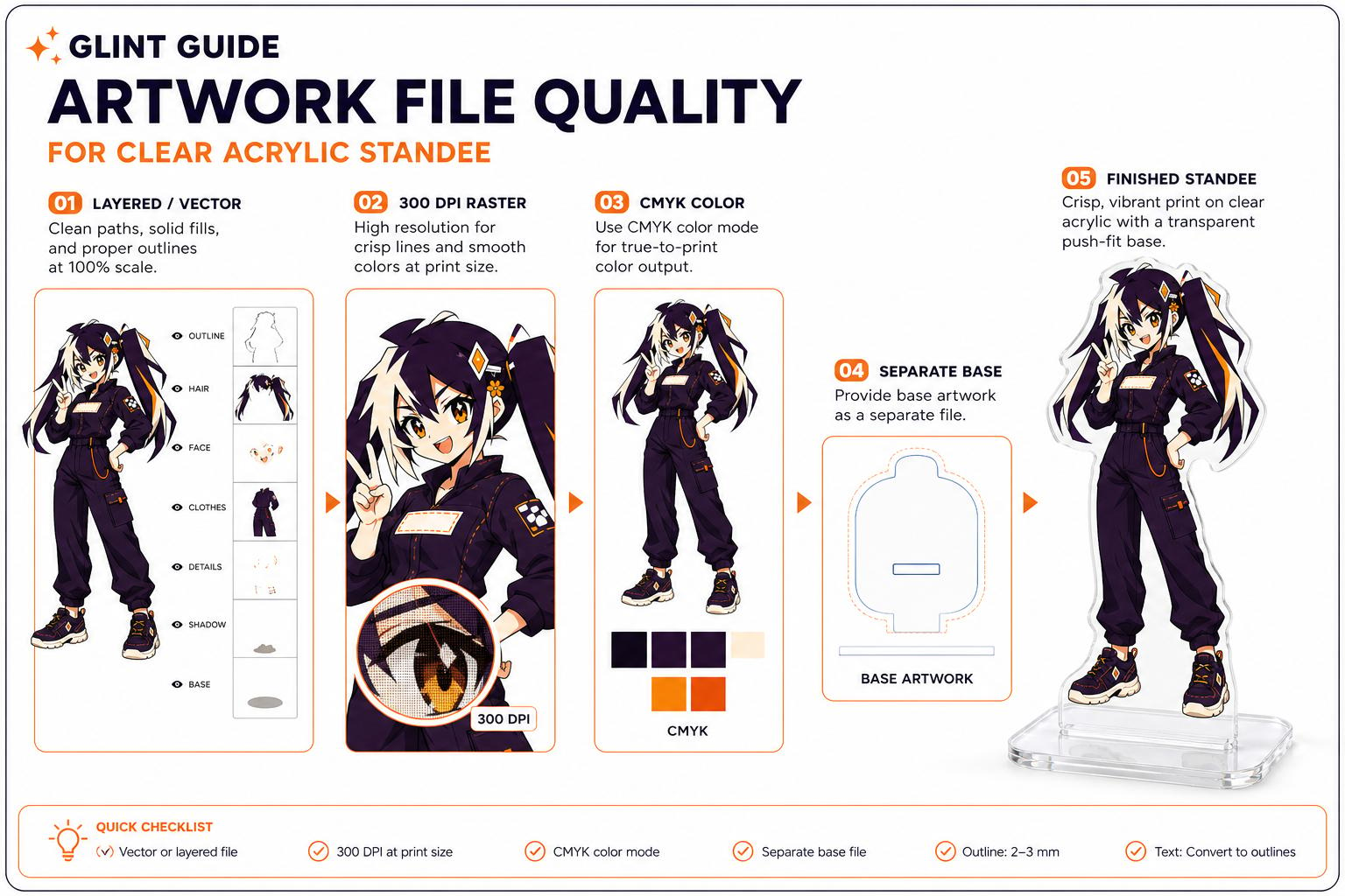
Prepare artwork at the intended physical output size and follow the file type, resolution and color workflow requested for this product. Keep the editable original and identify any color-critical details. A resolution label, color-space conversion or screen preview alone does not establish the accepted physical result.
- Keep every upright, base design and special effect on a named layer.
- Outline important fonts and remove unintended backgrounds.
- Name files consistently when an order contains several designs.
04
Plan the contour, white ink and effects
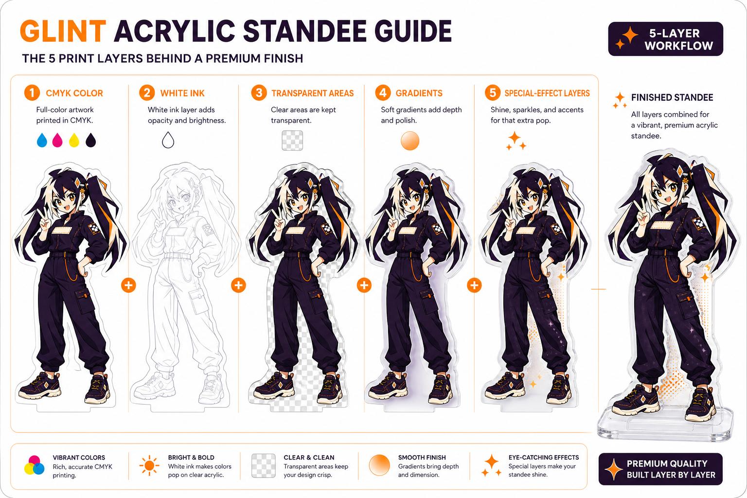
Use a smooth outer contour without fragile spikes or accidental gaps. For edge-to-edge printing, extend background color beyond the intended edge so normal cutting tolerance does not reveal a clear line.
A white-ink layer makes printed areas opaque. Put transparent windows, gradients and holographic masks on separate named layers with a short production note.
05
Prepare the front and back correctly
A same-art reverse may be mirrored, but mirroring reverses words, symbols and directional details. Upload separate front and back artwork whenever the reverse needs readable text or different content.
06
Treat the upright and base as one assembly
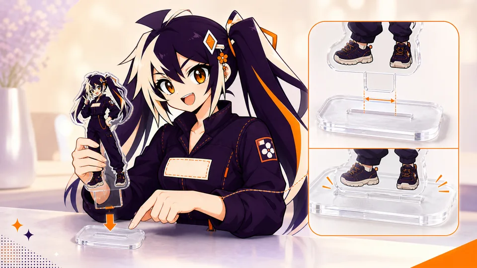
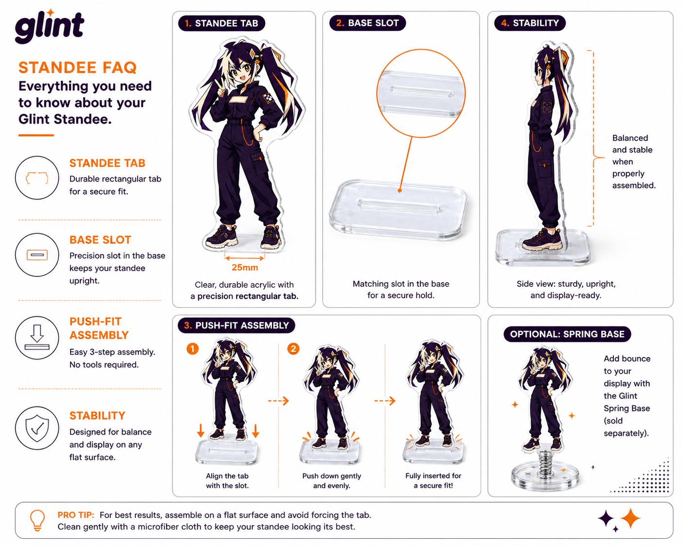
The upright tab, base slot, material thickness and center of gravity determine whether the display assembles cleanly and stands securely. Confirm the tab position, slot position and viewing direction together.
07
Review the proof before production
Check dimensions, spelling, orientation, contour, border, bleed, white ink, tab, base slots and quantities. A physical sample is useful when balance, fit, color or a special finish needs hands-on approval.
A proof is not a beauty render. It is the final map for size, orientation, contour, print layers, accessories and assembly. Compare it with the brief rather than relying on memory. Start with scope and dimensions, because a perfectly drawn cut line is irrelevant if the wrong design or size is shown. Then inspect spelling, front and back, color intent, transparent areas, effect masks, hardware and packing notes.
Comment with coordinates and decisions. Instead of writing 'the border looks wrong', say which edge is affected, what the expected border is and whether the contour or artwork should move. Consolidate comments into one response so two reviewers do not give conflicting instructions in separate messages. If the proof team explains a manufacturing constraint, update the brief with the agreed alternative; otherwise the same question may return during inspection or reorder.
Approve only the newest complete revision in writing. Save the approved proof with the order ID and final artwork. If a change is made after approval, request a revised proof for the affected item instead of assuming the change is obvious. The goal is a clean audit trail: anyone joining the project should be able to see what was ordered, what changed and exactly which image authorized production.
- Confirm finished dimensions and viewing direction.
- Pair every upright with its base and quantity.
- Approve the final proof in writing.
08
Design an acrylic contour that is clean and durable
The cut contour defines the physical silhouette, so it should be simpler than the drawing inside it. Remove tiny isolated gaps, accidental transparent pixels and needle-like projections that add cutting complexity without improving recognition. Zoom out and inspect the silhouette as a solid shape. If the character is still identifiable, the contour is doing its job.
Keep a comfortable acrylic bridge around hair tips, props, holes and internal valleys. Narrow bridges concentrate stress and make handling less forgiving. A clear border can protect delicate art, while full-bleed work needs background color extended beyond the intended edge. Follow the current product guide for bleed and minimum-feature values because they vary by construction and supplier.
The factory may redraw the production cut line from the submitted silhouette. That does not remove the designer's responsibility to show the intended shape. Include a clean preview, identify any intentional internal openings and inspect the proof around the entire perimeter. Pay special attention where the contour passes near a face, word, hole or standee tab; those areas combine visual and physical risk.
Color printed on clear acrylic can look translucent unless white ink is placed behind it. The white layer acts like a paper background, restoring opacity and contrast. Areas without white can reveal the clear, glitter or holographic material. This makes white ink part of the design: it decides which parts read as solid artwork and which parts allow the material or background to show through.
Create a named white-ink or opacity mask instead of relying on verbal instructions such as 'make the wings transparent'. Keep the mask aligned with the color art and avoid unintentional pinholes. Semi-transparent gradients need special attention because a hard white mask can destroy the fade, while no white at all may make pale colors disappear. Separate these transitions so the proof team can understand the intended layering.
Review transparency against more than one background. A clear window that looks elegant over white may make dark hair disappear over a black bag. A holographic effect can reduce text contrast when it crosses every letter. Use white ink to preserve the focal point and reserve transparency for supporting areas. If the effect is central to the product, approve a physical sample under ordinary light before committing to the full batch.
09
Control front, back and mirrored orientation
A same-art reverse is often created by mirroring the front, which is acceptable for symmetrical artwork without text or directional details. It is not acceptable when the design includes words, numbers, gestures, badges, clothing closures or an intentional left-right composition. Decide whether the back should be a mirror, a corrected repeat or a completely different illustration before preparing the files.
For different artwork on each side, use a shared outer silhouette and keep both compositions inside it. Overlay the front and back at partial opacity to find features that protrude or misalign. Consider how the white layer separates the two prints; without an intentional structure, dark areas from one side may affect the other or transparent windows may reveal unexpected content.
Label files with the same design prefix and explicit front/back suffixes. Show both sides upright in the review sheet rather than sending one side already flipped with no explanation. The production proof should identify the viewing direction, hole or tab position and side order. Read every word on both sides before approval. A mirrored spelling error is easy to miss in a technical layer view and obvious in a customer's hand.
A standee is a small assembly. The upright tab, base slot, material thickness, height and center of gravity determine whether it fits and remains standing. Do not resize a supplied tab or slot independently to make a layout look cleaner. If the artwork needs a different tab position, ask the production team to update the paired geometry so the physical fit remains intentional.
Place the support under the visual center of mass rather than the center of the canvas. Large hair, wings, props or an offset pose can pull the weight to one side. The base needs enough footprint to resist tipping and enough room for the slot without weakening an edge. In a multi-piece scene, also check that neighboring uprights do not collide, hide one another or make assembly confusing.
Design the base artwork around the slot and inserted tab. Important text should not disappear beneath the upright, and the intended front direction should be obvious. Review a full assembly proof showing upright, tab, base, slot and viewing direction. For unusually tall pieces, several slots or moving components, a physical sample answers balance and fit questions that a flat mockup cannot.
10
Package one complete standee handoff
Build a small handoff folder around a design ID. Keep the editable source, the requested production export, the paired base reference and a readable preview together. Use matching identifiers on the upright and base rather than expecting the reviewer to infer the pair from a character name. If the order contains several standees, include one manifest row for each upright-and-base combination and state the quantity of complete sets.
The preview should explain the assembly: the viewing side, the base orientation and any printing intended on the base. Label the dimensions that define the upright and the base separately. A flattened image of the assembled design is useful for intent, but it should not hide the separate production layers or replace the current factory template. Keep optional variants clearly marked so an unselected base shape or effect is not mistaken for an instruction.
Before sending the folder, open the exported files rather than relying on the editor view. Look for substituted fonts, missing linked artwork, unintended backgrounds and obsolete layers. Compare the export against the preview and the manifest. When a corrected proof arrives, record which file and template versions it uses. If a base or tab changes, review that dependency across every affected variant instead of approving only the most visible character artwork.
- One design ID shared by upright, base and preview
- Current template and requested production layers
- Finished dimensions and complete-set quantity
- Front/back and base viewing orientation
- One dated proof version for written approval
FAQ
Frequently asked questions
Can the base be approved separately from the upright?
They should be reviewed together because the tab, slot, support and viewing direction interact. You can supply separate files, but identify the pair and approve the assembled arrangement using the current template.
Does a white background mean a white-ink layer?
Do not rely on appearance alone. A white background in a preview may only represent the canvas. Mark where opacity is intended and identify the separate production layer or instruction requested for the job.
Can I mirror the front artwork for the back?
Only if that matches the intended reverse view. Text and directional details often need a different treatment. Provide labeled front and back views and confirm their orientation in the proof.
Is 300 ppi always the acceptance rule?
Check the requested file specification for the actual product and finished size. A resolution label alone does not establish image quality; inspect the pixel detail at the intended physical dimensions and keep the editable source.
What does a paper assembly test establish?
It helps compare layout, scale and visibility. It cannot confirm the manufactured tab-and-slot fit, material behavior or final balance. Those questions belong in the production review and any agreed physical sample.