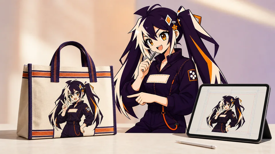
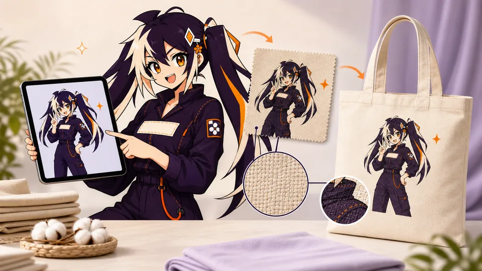
Natural canvas is not a neutral white screen. Its warm fiber color, visible weave and ink absorption all influence the contrast, saturation and fine detail of a printed design.
Evaluate the artwork against the selected fabric, follow the job-specific production workflow and identify priority colors and fine details. Use a physical sample when texture, color or print feel will determine approval, then keep the accepted reference with the order.
01
Key takeaways
Use these decisions to guide the detailed checks below.
- Treat the selected fabric color and texture as part of the design.
- Identify the colors and fine details that carry the artwork’s identity.
- Compare the same artwork on the proposed material and process.
- Record the lighting and reference used to judge a sample.
- Recheck changes to fabric, process or artwork on a repeat order.
| Design concern | Useful adjustment to explore | What still needs confirmation |
|---|---|---|
| Pale details | Stronger contrast or a different background | Appearance on the actual fabric |
| Fine lines | Simpler detail or revised scale | Reproduction with the selected process |
| Brand-critical color | A clearly identified reference | Accepted physical result and limits |
| Texture-sensitive artwork | A sample using the proposed construction | Detail and print feel on that material |
02
Treat fabric color as part of the artwork
Cream canvas warms every unprinted or transparent area. Darker fabric reduces contrast and may require a white underbase, which changes opacity and texture.
Separate the blank bag color from the printed color when describing a concern. The same pale illustration may have a different apparent contrast against a natural-looking fabric and a darker material. A screen simulation can help choose an approach, but it cannot reproduce the exact texture or printed result. Use it to identify questions for the sample rather than treating it as proof of a match.
For a hypothetical design with a cream-colored face and thin dark eyelashes, first decide which relationship matters: the face standing out from the fabric, the eyelash detail remaining clear, or both. Compare a stronger outline, a revised fill and a different placement at actual size. These are alternatives to review, not claims that a particular process or underbase is available on every Glintmade bag. Ask the production team to identify the supported setup for the selected item.
03
Expect the weave to interrupt fine detail
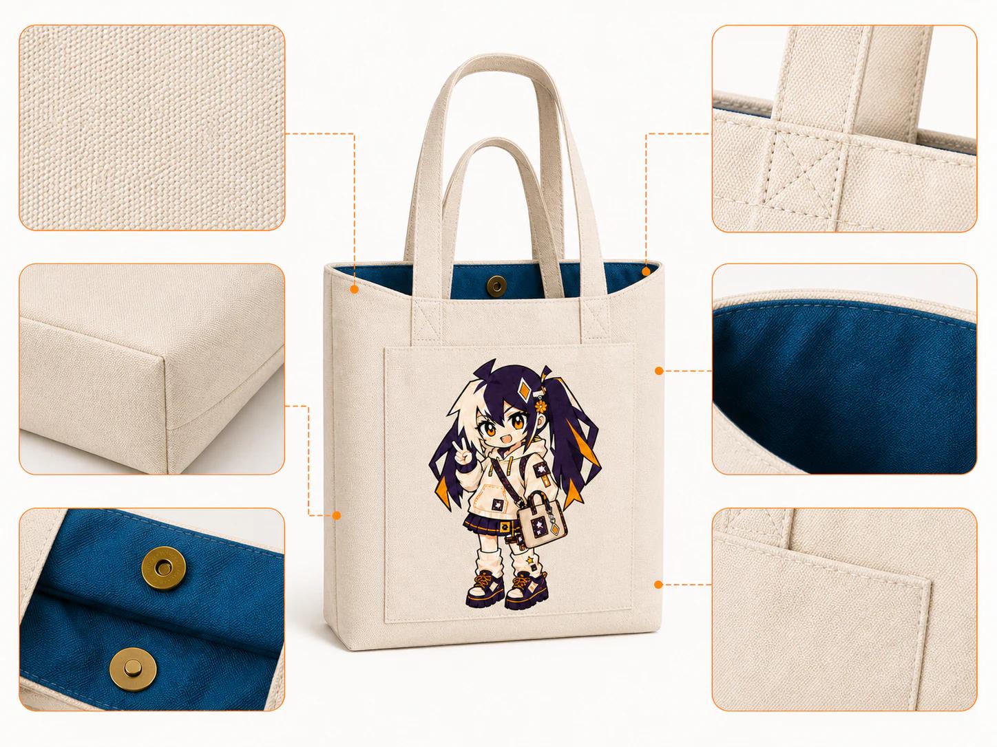
Tiny lines can cross raised threads and appear uneven. Increase line weight, simplify dense textures and preserve space around small lettering.
04
Match the printing method to the design
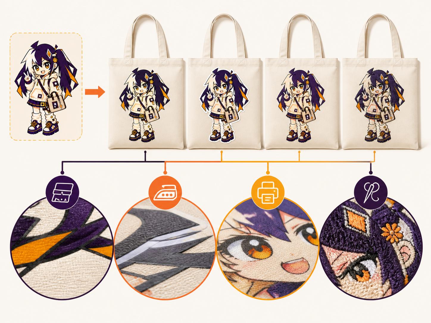
Solid spot colors, detailed full-color art and small-run transfers do not behave identically. Confirm the selected method before building effects that depend on transparency or ultra-smooth gradients.
05
Use references for color-critical work
Prepare artwork at the intended physical output size and follow the file type, resolution and color workflow requested for this product. Keep the editable original and identify any color-critical details. A resolution label, color-space conversion or screen preview alone does not establish the accepted physical result.
06
Approve a sample under ordinary light
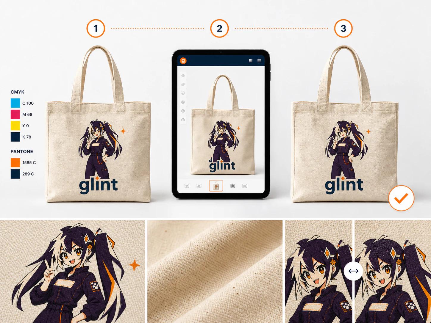
Review the sample indoors and in daylight, then compare it at normal viewing distance. Keep the approved material, print method and color notes attached to the repeat-order specification.
- Compare screen, proof and fabric side by side.
- Check shadows and pale skin tones.
- Record the accepted fabric and print method.
07
Treat fabric construction and print area as design constraints
A bag's outside dimensions are not its printable dimensions. Seams, gussets, pockets, handle stitching, folds and reinforced panels create areas where printing may be impossible or inconsistent. Use the current product template and ask how placement is measured. 'Centered on the bag' and 'centered in the printable area' can produce different results when construction is asymmetric.
Fabric choice changes the visual base. Natural canvas has a warm tone and visible weave; dyed canvas may need an underbase for opacity; lighter or more flexible fabrics can show the contents or fold through a large print. Review material weight, texture, lining and structure in relation to the actual use. A bag meant to carry books has different construction priorities from a lightweight event giveaway.
Mark finished print width, height and reference position on the proof. Check the artwork with the bag both flat and filled, because handles and folds change what is visible. Keep critical text and faces away from seams and high-flex zones. For designs that cross pockets or panels, confirm that the selected print process and factory setup can maintain acceptable alignment before finalizing the composition.
Different print methods favor different artwork. Solid spot colors and bold logos may suit one process, while detailed full-color illustration or small-run personalization may suit another. Ask the factory which method is planned before building a design around transparent gradients, extremely fine halftones or a texture the process cannot reproduce consistently.
Prepare the file for the chosen method. Vector shapes and defined spot colors are useful for simple graphic printing. Full-color processes need clean raster detail at output size and may use a white underbase on dark fabric. Transfer-based methods can produce strong detail but create a different surface feel from ink that interacts more directly with the fibers. Decide whether visual accuracy, softness, durability, order size or color count is the leading priority.
The proof should state print size, placement, method and color intent together. A digital mockup cannot show hand feel or fabric absorption, so request a sample when those qualities matter. Save the approved method with the artwork and material reference. Switching methods on a reorder while keeping the same image can change color, texture and edge behavior enough to make the new batch look like a different product.
08
Adapt color and fine detail to the canvas weave
Canvas threads create a textured surface that interrupts very small marks. Hairline strokes, tiny type and subtle low-contrast gradients can break across raised fibers or fill unevenly. Review the design at actual size, enlarge important line work and preserve clean space around facial features and lettering. The goal is not to remove detail, but to decide which details must survive normal viewing distance.
Treat the fabric color as the first color in the composition. Natural canvas warms transparent and unprinted areas. Dark fabric may reduce the brightness of color or require a white underbase. Pale skin tones, gray shadows and muted brand colors deserve special review because their contrast can change more than saturated accents. A monitor preview over pure white is not a reliable substitute for the actual base fabric.
For color-critical work, identify priority colors and compare a physical sample under ordinary indoor light and daylight. Note the material batch, print method and accepted result. If exact repeatability is essential, discuss tolerance and reference standards before production. Fabric is a physical substrate with natural variation, so the specification should focus on the colors and visual relationships that matter most to the product's identity.
A display emits light; acrylic, vinyl and fabric reflect it. That is why a bright RGB screen preview cannot promise the same appearance in print. Prepare production art in the color mode requested by the factory, and keep the original wide-gamut artwork archived. If a brand color matters, identify it clearly and provide a recognized color reference or approved physical sample instead of describing it as 'the orange on my screen'.
Material changes the result as much as ink. Clear acrylic needs white ink behind areas that should look opaque. Holographic film introduces moving highlights. Natural canvas warms light colors and breaks continuous detail with its weave. Transparent sticker stock allows the application surface to participate in the design. Previewing the same art over a plain white background hides these interactions, so review it against a material simulation and then verify with a sample when the launch is color-sensitive.
Choose priorities rather than demanding that every pixel match a monitor. Identify the two or three colors that define the character or brand, then decide which variations are acceptable in shadows, gradients and photographic areas. Review samples under ordinary indoor light and daylight, not only beneath a phone flashlight. Record the accepted material, print method and color notes so a reorder does not begin from memory.
09
Create a useful material and color comparison record
Compare samples with one question in mind at a time. If two samples change the fabric, artwork scale and printing process simultaneously, you cannot easily tell which change caused the difference you prefer. Record those variables beside each sample. Keep a small original reference image for context, but make the physical material and accepted production result identifiable by version.
Choose a consistent viewing setup for the decision and note it. Avoid comparing one sample under a warm desk lamp with another in a bright product photograph. If the merchandise will be used in different environments, look at those environments deliberately and record the important differences. The purpose is to agree on a usable reference, not to promise that fabric will look identical under every light or on every screen.
Make the approval specific. Identify the fabric, print area, artwork version and sample that were accepted, then state which elements were critical and which differences were acceptable. Keep any unresolved concern visible for the supplier. If a later order changes the bag construction or material, reopen the relevant decision rather than relying on the earlier photograph. The comparison record should let another reviewer understand both the intended appearance and the limits of the previous approval.
- Fabric and construction reference
- Artwork and process used on each sample
- Priority colors and details
- Viewing setup used for acceptance
- Changes that require another review
FAQ
Frequently asked questions
Why does the same file look different on two fabrics?
The substrate color and visible texture contribute to what the viewer sees. Different production setups can also affect the result. Compare the specified materials and processes rather than assuming the file alone defines the appearance.
Will a Pantone reference guarantee an exact result?
A reference communicates intent; it does not by itself establish an exact physical match on every material. Ask how the reference will be used for the selected job and agree on an appropriate acceptance sample or other check.
Can I approve color using a phone photo?
A photo can communicate an issue, but lighting, camera processing and displays change its appearance. Identify the physical reference and viewing conditions when color is central to the decision.
Should I change all pale colors?
Evaluate the important details on the proposed material. Some pale areas may be intentional. Strengthen or simplify only where necessary to preserve the design’s priorities, and review the result before committing to production.
Can a reorder use the old sample?
It is a useful reference if the relevant artwork, material and process remain applicable. Record any changes and ask which elements need renewed confirmation rather than assuming an earlier approval covers every later construction.