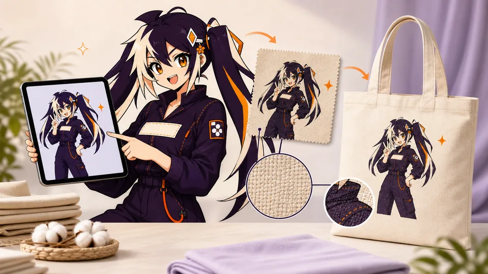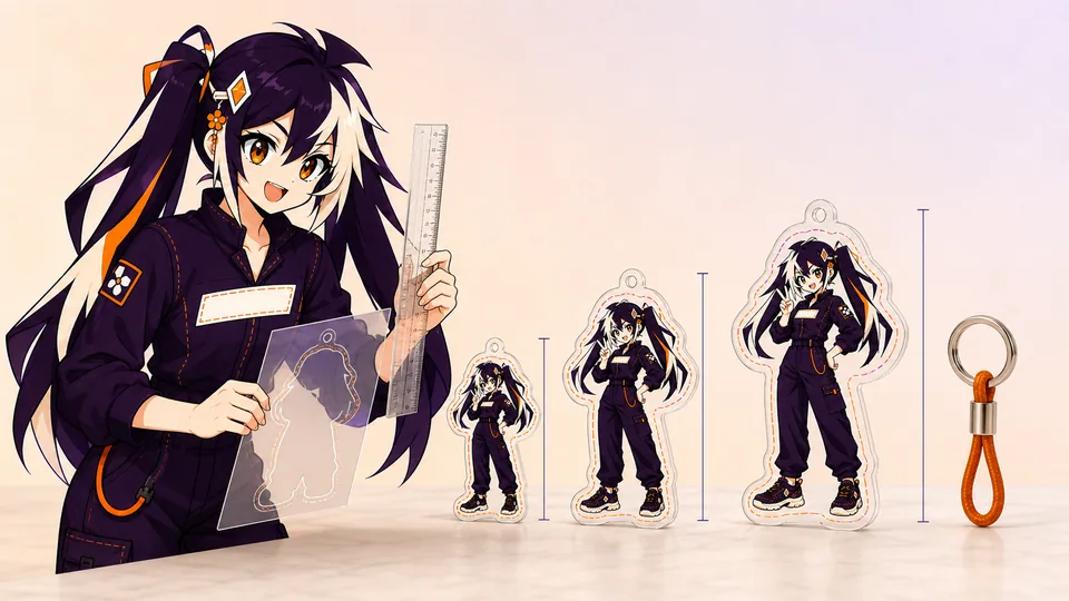

A special acrylic finish is part of the composition, not a filter applied after the design is complete. Clear, glitter, rainbow and epoxy surfaces change contrast, depth and the way negative space reads.
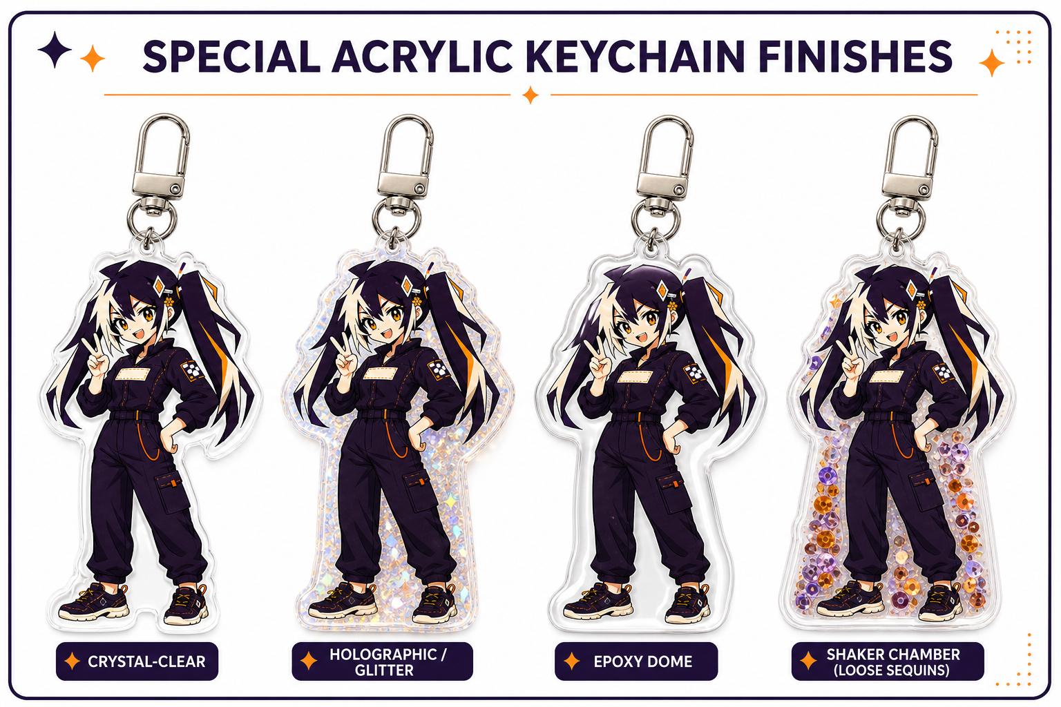
Choose clear for clean color, glitter for embedded sparkle, rainbow holographic for angle-dependent highlights and epoxy for a glossy domed surface. Test the same artwork against the effect before approving it.
01
Key takeaways
Use these decisions to guide the detailed checks below.
- Choose the finish around the artwork’s focal point.
- Compare the same design and size when evaluating effects.
- Mark where transparency, white ink and an effect are intended.
- Inspect angle-dependent effects in more than one view.
- Record the accepted finish and artwork together for reorders.
| Finish direction | Visual goal | Question to review |
|---|---|---|
| Clear | Let the printed artwork and open regions lead | How do opacity and background interact? |
| Glitter | Add visible sparkle within the composition | Does the effect compete with fine detail? |
| Rainbow/holographic | Use an appearance that changes with viewing angle | Which parts remain readable across views? |
| Epoxy | Explore a glossy raised surface appearance | How does the physical sample compare with the intended look? |
02
Clear acrylic keeps the artwork in control
Clear material gives predictable color and makes transparent windows easy to plan. White ink determines which printed areas stay opaque.
03
Glitter works best in intentional open areas
Dense art can hide embedded sparkle. Leave selected backgrounds or accents free of white ink so the glitter participates without reducing facial or text readability.
04
Rainbow effects change with viewing angle
Holographic highlights are strongest in motion and may cross printed colors differently under each light. Use them as an accent rather than the only source of contrast.
05
Epoxy adds depth and a rounded gloss
A domed coating makes the surface feel smoother and more dimensional, but reflections can soften very small details. Keep critical lines bold and away from extreme edges.
06
Compare one design across finishes
Use the same artwork mockup or sample to isolate the material difference. Review edge appearance, white ink and hardware color together.
Define what the effect is meant to contribute. It might support an energetic background, emphasize empty space or create a different surface impression. If that purpose cannot be described, the finish may be adding cost or complexity without helping the design. Obtain the actual quotation for the selected options; this guide does not establish a price order or imply that every combination is available.
Imagine a hypothetical character design with a bright background and a small facial expression. Compare a version where the effect surrounds the face with one where it competes directly with those details. The exercise is about visual priority, not a promise of a specific mask or manufacturing technique. Show the preferred appearance and ask the production reviewer how the current product can achieve it. Keep unresolved capability questions separate from the approved art.
- Prioritize readability over maximum sparkle.
- Mark transparent and opaque areas.
- Request a sample for effect-critical launches.
07
Choose special acrylic effects for the artwork, not the trend
Clear acrylic gives the artwork the most control. Glitter adds embedded sparkle, holographic films create angle-dependent highlights, rainbow or tinted materials introduce a color cast, and epoxy can add a smooth domed surface. None is automatically more premium for every design. The best finish supports the subject, lighting and selling context without reducing the readability of faces, logos or small text.
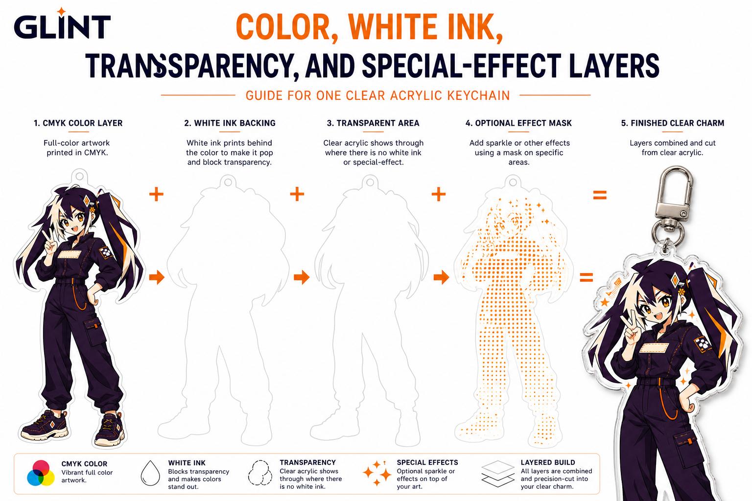
Plan an effect mask with focal hierarchy. If every open area sparkles, the material competes with the illustration. Reserve stronger effects for a halo, accessory, background shape or other deliberate zone. White ink can block the effect beneath important color while transparent windows reveal it. Name the effect layer and include a simple black-and-white preview showing where the material should remain visible.
Judge reflective finishes in motion and under several lights. A still screen mockup cannot fully represent how holographic or refractive surfaces change with angle. Request a sample for an effect-critical launch and photograph it in the lighting used for the store or campaign. Keep that sample and its layer files together so future variations can reuse the successful balance instead of rebuilding it from a screenshot.
Color printed on clear acrylic can look translucent unless white ink is placed behind it. The white layer acts like a paper background, restoring opacity and contrast. Areas without white can reveal the clear, glitter or holographic material. This makes white ink part of the design: it decides which parts read as solid artwork and which parts allow the material or background to show through.
Create a named white-ink or opacity mask instead of relying on verbal instructions such as 'make the wings transparent'. Keep the mask aligned with the color art and avoid unintentional pinholes. Semi-transparent gradients need special attention because a hard white mask can destroy the fade, while no white at all may make pale colors disappear. Separate these transitions so the proof team can understand the intended layering.
Review transparency against more than one background. A clear window that looks elegant over white may make dark hair disappear over a black bag. A holographic effect can reduce text contrast when it crosses every letter. Use white ink to preserve the focal point and reserve transparency for supporting areas. If the effect is central to the product, approve a physical sample under ordinary light before committing to the full batch.

08
Use samples to answer the expensive questions
A sample is most valuable when it tests a defined risk. For acrylic, that risk may be white-ink opacity, a standee's balance or the interaction between two effect layers. For stickers, it may be adhesion, laminate glare or the readability of a small cut. For canvas, it may be print color, hand feel or placement across a textured surface. List the questions before ordering the sample so approval is based on evidence rather than a general impression.
Review the sample in the way customers will use it. Attach a keychain to the intended bag, assemble and disassemble a standee, apply a sticker to a representative clean surface, or carry and fold a tote. Photograph the approved sample in neutral light and measure the details that matter. Note whether protective film has been removed; acrylic can look cloudy or scratched while transport film is still present.
Classify findings as artwork changes, production changes or acceptable variation. If a line is too thin, revise the art. If a slot is difficult to assemble, ask the factory to review fit. If a subtle color shift is acceptable on natural fabric, record that tolerance. A sample only improves the next batch when its decisions are written into the specification and linked to the final revision.
09
Compare finishes without changing the whole experiment
Choose one representative design before comparing effect options. Keep its dimensions, major color relationships and intended use consistent so the comparison reveals the finish rather than unrelated artwork changes. Include a fine-detail area, a focal feature and an open region if those are important to the actual design. Do not add an effect simply because an unrelated product photograph looks appealing.
Review the options against a short decision list: recognizable artwork, readable text, intended contrast and the role of the effect. For an appearance that changes with angle or light, record more than one view and identify the conditions. A single still image can communicate one appearance, but it cannot establish every view of the physical object. Ask for the appropriate product explanation or sample if the effect is central to the purchase decision.
After choosing, record the exact product option, artwork version, opacity instructions and accepted reference. Keep rejected options out of the production folder or clearly label them as alternatives. If a later revision changes the artwork scale or introduces small text, repeat the relevant effect check: the previously selected finish may interact differently with the new composition. Treat the result as one approved combination, not a general preference that automatically covers every design.
When requesting comparison media, explain the decision you are trying to make. Ask to see the same artwork area in the views that reveal the intended effect and the important readable detail. This gives the supplier a useful question to answer without requiring a particular camera setup or implying that photography is a physical performance test. Keep any uncertainty about color or texture visible after reviewing the images.
Record whether you are accepting the overall impression or a particular detail. A buyer might like the general sparkle but still need a small logo to remain readable. Those are separate decisions, and one should not be taken as approval of the other. If the artwork changes after selecting the effect, revisit the affected detail before signing off. Save the final option name and accepted reference with the actual product specification so a similar-looking option in a later catalog is not substituted merely because its marketing photograph looks familiar.
- Same design and dimensions across candidates
- Focal point and readable details identified
- Transparent, opaque and effect regions labeled
- Views or sample appropriate to the effect
- One selected option linked to the approved artwork
FAQ
Frequently asked questions
Which finish is always best for detailed artwork?
There is no universal answer. Compare the effect with the actual design, scale and intended use. The important details must remain clear, and the selected construction should be confirmed for that product.
Can I judge a holographic effect from one photo?
One photo shows one combination of angle and lighting. Use additional views or an appropriate sample when the changing appearance affects your decision. Do not interpret a still preview as a guarantee of every physical view.
Does an effect remove the need for a white-ink plan?
No. Opacity, transparent regions and the effect still need clear instructions for the selected construction. Ask how the production layers should be supplied and verify their relationship in the proof.
Can I assume epoxy makes any design more durable?
Do not use the finish label as a blanket performance guarantee. Confirm the actual product construction and any supported performance information. This guide compares appearance and approval decisions, not tested durability ratings.
Should all designs in a collection have the same finish?
A consistent finish may help the collection feel coherent, but it can interact differently with each artwork. Review representative details and record the approved choice by design rather than applying it without checking.