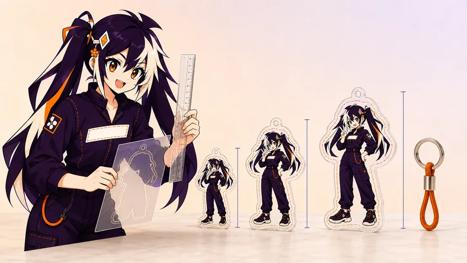
The best keychain size is not simply the largest option your budget allows. It is the smallest finished size that keeps the artwork readable, leaves safe acrylic around the hole and feels balanced with the selected hardware.
Measure the longest finished edge, including the acrylic border and hanging tab. Test the artwork at 100% size, protect fine details from the cut edge and choose hardware after the final scale is fixed.
01
Key takeaways
Use these decisions to guide the detailed checks below.
- Measure the finished acrylic outline, including border and attachment tab.
- Choose size from readability and use, not editing zoom.
- Review the hole, connector and hardware as one assembly.
- Treat the same artwork in another size as a new proof decision.
| Decision | Smaller candidate | Larger candidate |
|---|---|---|
| Artwork | May need simplified details | May retain more detail; still test |
| Handling | Check the attachment does not dominate | Check bulk and how it hangs |
| Outline | Watch narrow features and hole spacing | Recheck the whole silhouette |
| Approval | Actual-size mockup plus assembly proof | Same checks; enlargement alone is not approval |
02
Measure the finished acrylic, not only the artwork
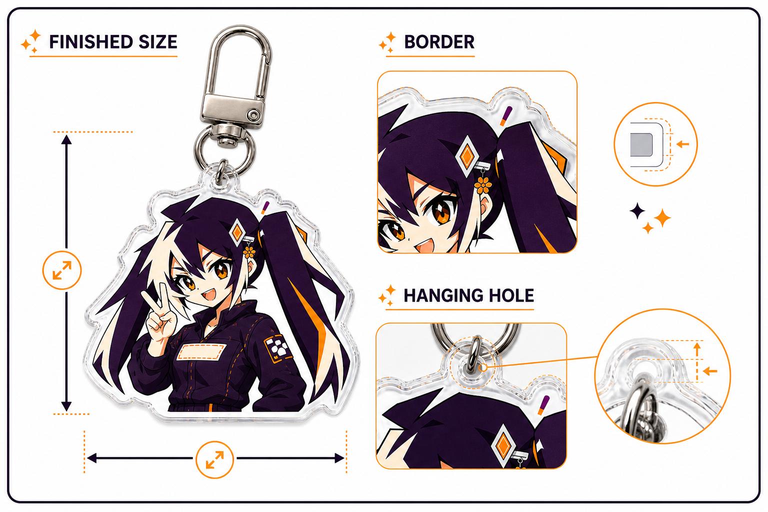
A quoted size normally follows the longest finished edge. The clear or printed border around the illustration is part of that measurement, as is any top tab that carries the hole.
Print a paper test at 100% before ordering. If the face, small type or accessory disappears on paper, enlarging the canvas on screen will not rescue it in production.
Write down what the measurement excludes as well as what it includes. A product image can show the acrylic body, a metal ring and a connector in one view, while the quoted acrylic size describes only the cut part. Ask the reviewer to label the boundaries rather than inferring total hanging length from the image. For a set, use the same convention on every design so quantity and quotation comparisons remain meaningful.
For example, imagine a tall character and a round emblem that share the same longest-edge measurement. This is a design comparison, not a recommended production size. Their apparent scale, space for detail and relationship to the hardware can still differ substantially. Put the two physical outlines beside each other before treating a shared number as a consistent collection. You may prefer a common visual presence over an identical longest-edge value, but record that decision explicitly.
03
Protect small details and line weight
Keep essential lines comfortably inside the contour and avoid needle-thin projections. Small highlights and fine text need stronger contrast than they do on a bright monitor.
- Simplify tiny background objects.
- Use a clear hierarchy between the character and decorative effects.
- Judge readability at normal viewing distance.
04
Choose a clear border or full-bleed edge
A clear border adds visual breathing room and protects narrow artwork. Full-bleed artwork feels bolder but needs color extended beyond the intended cut so minor tolerance does not create a transparent sliver.
05
Leave safe material around the hanging hole
The hole should not touch the contour or a fragile strand of artwork. Leave enough acrylic between the hole and edge to carry daily pulling force, and keep important facial or logo details away from the hardware connection.
06
Match hardware to size and use
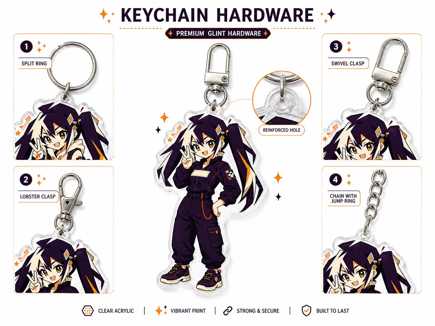
A small charm can look overwhelmed by a large clasp, while a larger piece needs hardware that supports its weight. Decide whether the keychain will sit on keys, a bag, a zipper or a display loop before confirming the attachment.
- Confirm clasp finish and connector count.
- Check total hanging length, not only acrylic height.
- Review the proof with the chosen hardware shown.
07
Judge the design at actual size, not at editing zoom
Design software encourages close-up decisions. A face that looks expressive at 400% may lose its eye highlights at keychain size, and a neat line of text may become a dark bar on a small sticker. Set the document to the intended finished dimensions, view it at 100% and print a paper mockup when possible. Hold the mockup at the distance a buyer will normally see it. This quick test reveals problems that resolution numbers alone cannot show.
Look for visual hierarchy before detail. The main character, logo or message should still read first. Secondary decorations should support it rather than compete with it. If several small details merge, decide which one carries the idea and simplify the rest. Enlarging every object is rarely the best solution; stronger contrast, cleaner negative space and slightly heavier line work usually preserve more of the original composition.
Actual-size review also catches physical conflicts. Hardware can cover a top ornament, a standee slot can cross base text, a canvas seam can sit under a logo and a sticker border can consume more of the finished size than expected. Add these physical elements to the mockup instead of reviewing the illustration in isolation. The result should look intentional as a complete product, not merely as a correctly exported image.
The cut contour defines the physical silhouette, so it should be simpler than the drawing inside it. Remove tiny isolated gaps, accidental transparent pixels and needle-like projections that add cutting complexity without improving recognition. Zoom out and inspect the silhouette as a solid shape. If the character is still identifiable, the contour is doing its job.
Keep a comfortable acrylic bridge around hair tips, props, holes and internal valleys. Narrow bridges concentrate stress and make handling less forgiving. A clear border can protect delicate art, while full-bleed work needs background color extended beyond the intended edge. Follow the current product guide for bleed and minimum-feature values because they vary by construction and supplier.
The factory may redraw the production cut line from the submitted silhouette. That does not remove the designer's responsibility to show the intended shape. Include a clean preview, identify any intentional internal openings and inspect the proof around the entire perimeter. Pay special attention where the contour passes near a face, word, hole or standee tab; those areas combine visual and physical risk.
08
Plan the hole, connector and hardware as one system
The hanging hole is a load-bearing feature, not a decorative dot. Place it where enough acrylic remains between the opening and the outer edge, and avoid attaching it to a thin strand of hair or a narrow prop. The position also controls balance: a visually centered hole can make an asymmetric charm hang at an angle. Mock up the finished piece with the intended connector before approving the contour.
Hardware changes the scale and use of the product. A large clasp can overpower a small charm; a tiny connector can feel out of proportion on a larger piece. Confirm clasp type, color, connector count and total hanging length. If the keychain attaches to a zipper, phone strap or bag handle rather than keys, state that use because the attachment and movement are different.
Keep important artwork away from the hardware connection. A top logo or face may be covered by a jump ring even though it appears clear on a flat artwork preview. The proof should show the actual hardware relationship, not only the bare acrylic. For multi-part or series-connection designs, review how each component rotates and whether adjacent pieces strike or obscure one another during use.
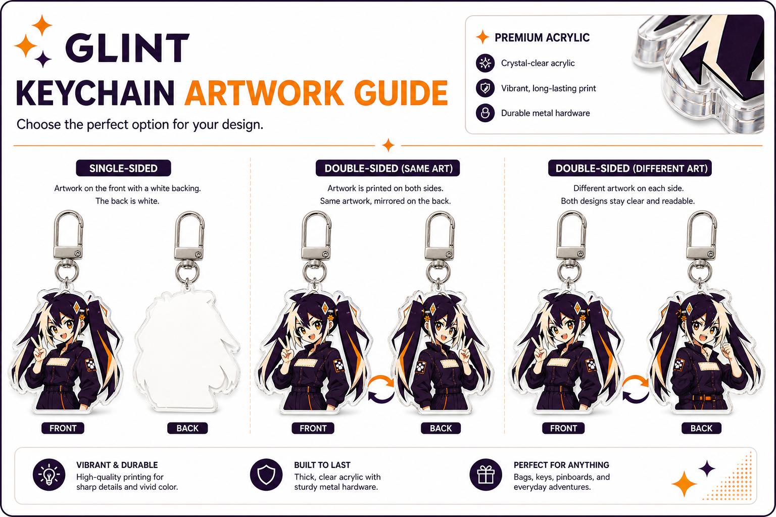
A same-art reverse is often created by mirroring the front, which is acceptable for symmetrical artwork without text or directional details. It is not acceptable when the design includes words, numbers, gestures, badges, clothing closures or an intentional left-right composition. Decide whether the back should be a mirror, a corrected repeat or a completely different illustration before preparing the files.
For different artwork on each side, use a shared outer silhouette and keep both compositions inside it. Overlay the front and back at partial opacity to find features that protrude or misalign. Consider how the white layer separates the two prints; without an intentional structure, dark areas from one side may affect the other or transparent windows may reveal unexpected content.
Label files with the same design prefix and explicit front/back suffixes. Show both sides upright in the review sheet rather than sending one side already flipped with no explanation. The production proof should identify the viewing direction, hole or tab position and side order. Read every word on both sides before approval. A mirrored spelling error is easy to miss in a technical layer view and obvious in a customer's hand.
09
Design for normal production tolerance
Printing, cutting, coating, sewing and assembly all have physical tolerances. The correct response is not to expect zero movement; it is to keep important information away from the areas where small movement becomes visible. Safe zones protect faces and text. Bleed protects edge-to-edge color. Generous material around a hole protects the connection. Clear spacing around a standee slot protects base artwork.
Tolerance becomes more noticeable when a design uses a very thin border, a perfectly concentric ring or a narrow color change at the cut edge. These features turn tiny shifts into obvious visual errors. If that precision is central to the concept, discuss it before quotation and test a sample. Otherwise, widen the border, continue the background color, or make the transition less dependent on exact registration.
Do not hide a tolerance-sensitive feature inside a generic note. Mark it on the art and in the brief, then look for it in the proof and sample. The production team can often suggest a safer construction, but only if the intention is visible early. Good production design accepts the behavior of the process and uses it as a constraint, just as editorial design accounts for trim and responsive web design accounts for different screen sizes.
10
Compare candidate sizes with a repeatable trial
Prepare two or three physical-size paper outlines of the same artwork. Label each with its finished dimensions and keep the border and attachment tab visible. Do not compare one plain artwork image against another that includes the full acrylic shape: the difference could be the measurement boundary rather than a meaningful size choice. Place each version beside the intended use context, such as a bag attachment, and photograph the candidates together.
Record what changes between candidates. Is the face still recognizable? Does the smallest text remain useful, or should it be removed? Does the attachment point interrupt the composition? A paper trial answers visual-scale questions, but it cannot establish acrylic strength, hardware movement, finish or the feel of the assembled object. Mark those questions for the production proof or a physical sample rather than giving a paper model more authority than it has.
Select the candidate that meets the use case with the fewest unresolved compromises. Save the rejected alternatives with short reasons, then send only the clearly named selected production version. If the factory proposes a contour or hole change, update the recorded finished dimensions and repeat the relevant checks. A size decision is complete when another person can identify the approved outline, artwork and hardware combination without choosing between several files called final.
- Selected dimensions and units
- Artwork and outline version
- Readability result at normal viewing distance
- Hole and hardware questions still to confirm
- Named proof or sample that closes those questions
FAQ
Frequently asked questions
Should every design in a collection use the same size?
Not necessarily. A shared longest edge can make a narrow character and a round logo look very different. Compare physical outlines and choose whether consistent dimensions or consistent visual presence matters more. Record each approved size separately.
Does the hanging ring count toward the acrylic size?
Do not assume it does. Identify the acrylic body, attachment tab and assembled hanging length separately. Ask the production reviewer to label the dimensions used for the quote and the final proof.
Can I make a design smaller without changing the file?
Scaling changes small details, text and spacing around the edge. Repeat the actual-size check and have the contour, hole and attachment reviewed. An approved larger version does not automatically approve a smaller one.
Will a paper mockup prove the keychain is strong enough?
No. It can help judge composition and apparent size. Material, hole geometry, hardware movement and durability depend on the physical construction and require the appropriate production confirmation or sample.
What information makes a size quote useful?
Provide the artwork, the intended use, candidate dimensions, border preference, hardware choice if known, quantities per design and a required arrival date. State any dimensions that remain undecided.