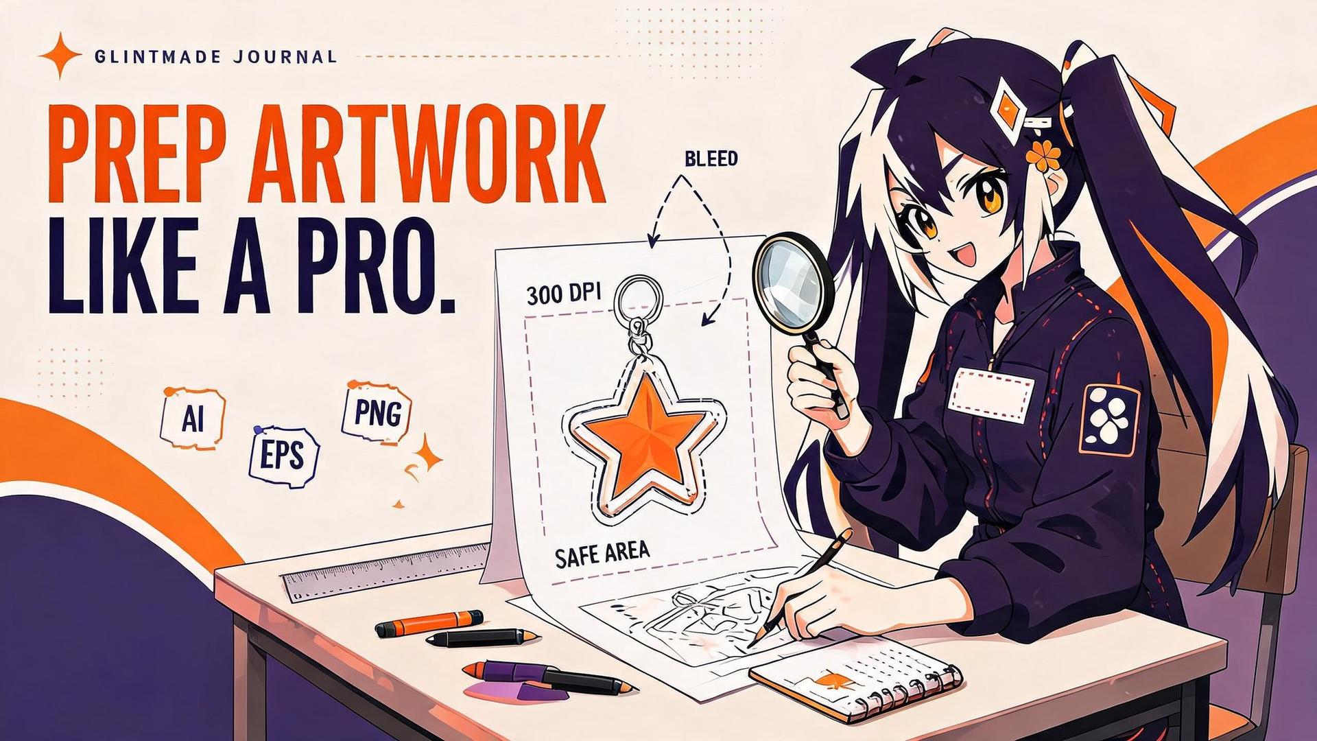
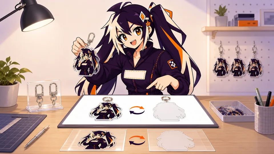
Single-sided and double-sided acrylic are not only pricing options. They determine how white ink, transparency, text and directional character details must be arranged in the production file.
Use one front file for single-sided printing, a confirmed mirrored reverse for identical double-sided art, and separate labeled front and back files whenever text or directional details must read correctly.
01
Key takeaways
Use these decisions to guide the detailed checks below.
- Choose the intended front and reverse appearance before exporting files.
- Label front and back by a shared design ID and viewing direction.
- Treat text and asymmetric details as orientation checks.
- Specify transparent and opaque regions instead of relying on preview backgrounds.
- Approve the paired views and one compatible cut outline together.
| Arrangement | Useful when | Proof question |
|---|---|---|
| Single printed design | One primary image defines the product | How should that image look from the reverse? |
| Matching front and back | The intended artwork repeats on both views | Is the reverse orientation correct? |
| Different front and back | Text or a second composition must read independently | Are the files paired and aligned to one outline? |
02
Understand the three common print structures
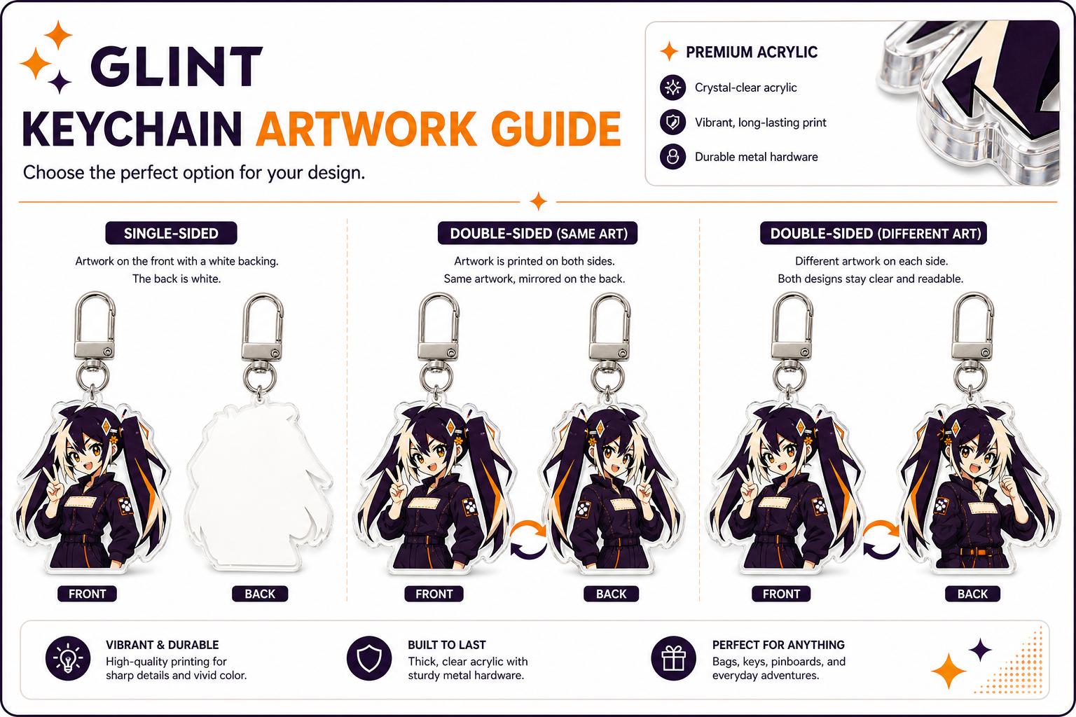
Single-sided printing places the main artwork on one side. Same-art double-sided printing repeats the design on the reverse, while different-art printing allows a true back view or alternate composition.
Describe the result you want to see when the item is turned over. The phrase double-sided can describe the visual goal without explaining the actual layer arrangement. Ask the production reviewer how the selected product achieves that result. Keep the answer tied to that product; it should not be generalized to every acrylic construction or printing process.
For a hypothetical character with a name on the front and a short message on the back, prepare each view as a readable composition and indicate which way is up. A simple mirror operation can reverse the lettering even if the outer silhouette still matches. Conversely, two individually correct files can be mispaired in a multi-design order. The approval record should therefore check both orientation and identity.
03
Do not mirror readable or directional details
Mirroring reverses words, hand gestures, badges and clothing closures. If those details matter, supply a separate back view rather than asking the factory to infer corrections.
04
Keep color and white ink intentional
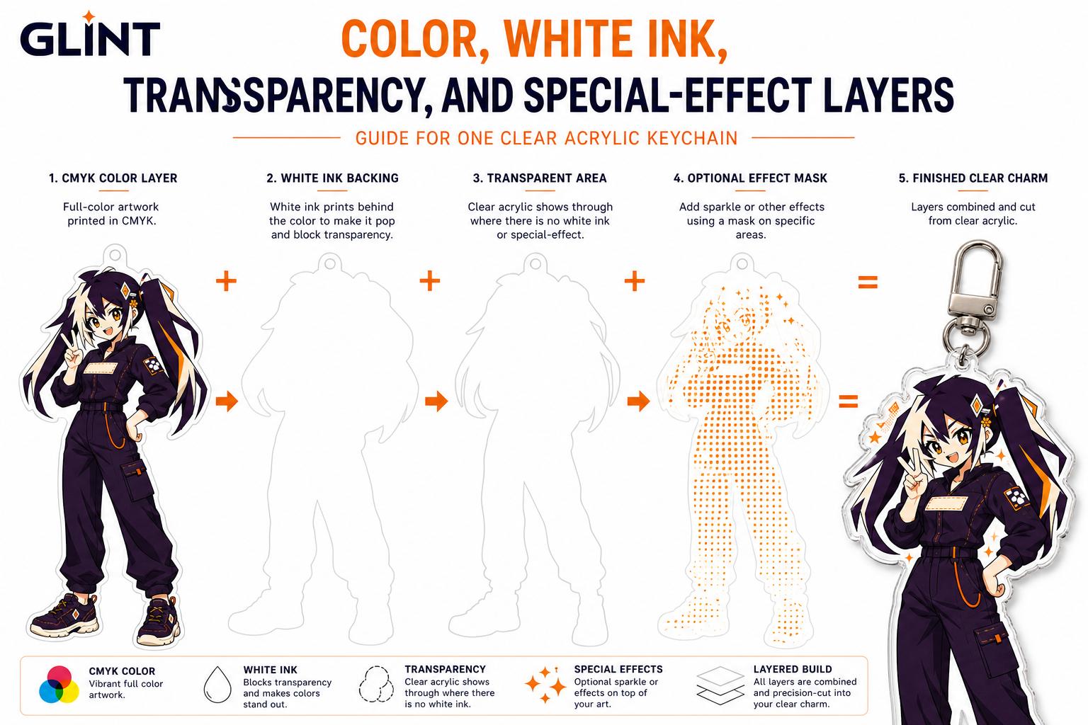
White ink controls opacity on clear acrylic. Separate semi-transparent areas, white backing and special effects so the proof shows which parts can be seen through from either side.
05
Use one compatible outer silhouette
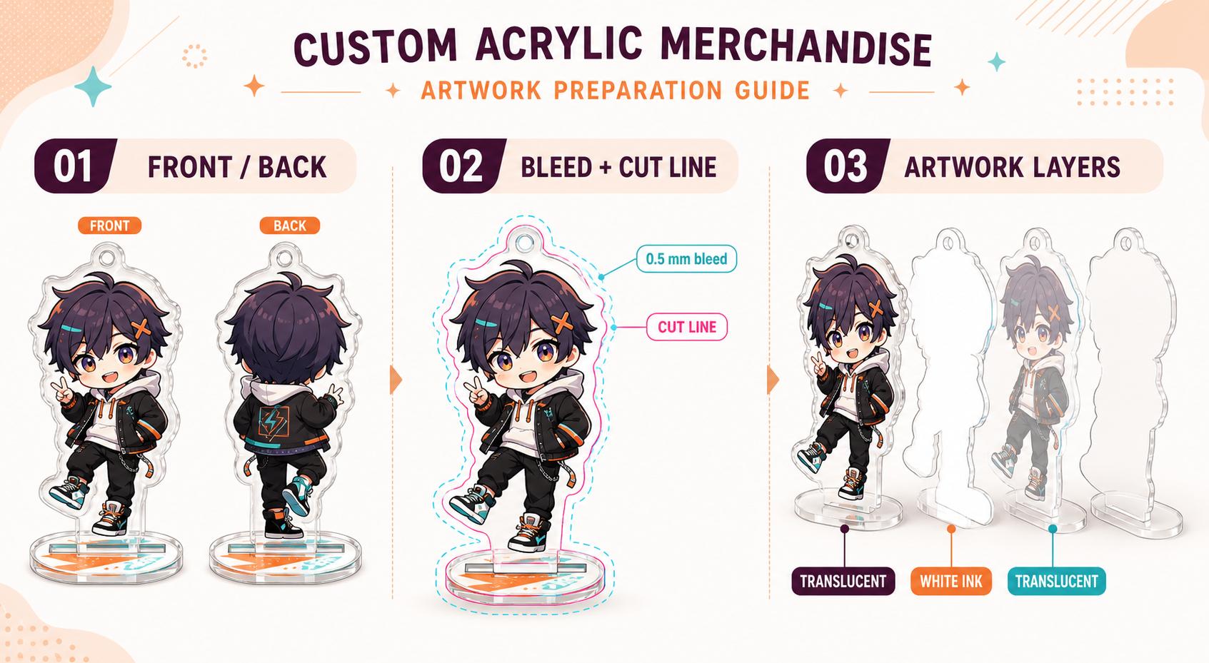
Front and back art can differ, but both sides need a coherent cut shape. Keep important content inside the shared safety area and avoid a reverse-side element that unexpectedly protrudes beyond the front contour.
06
Label, pair and proof every design
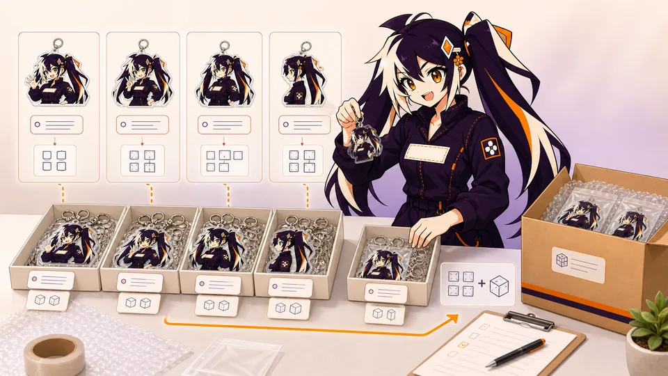
Use names such as Design-A_front and Design-A_back, then assign a quantity to the pair. Check viewing direction, hole position and hardware in the proof.
- Confirm front and back at normal orientation.
- Check transparent areas from both sides.
- Approve the shared cut contour and quantity.
07
Control front, back and mirrored orientation
A same-art reverse is often created by mirroring the front, which is acceptable for symmetrical artwork without text or directional details. It is not acceptable when the design includes words, numbers, gestures, badges, clothing closures or an intentional left-right composition. Decide whether the back should be a mirror, a corrected repeat or a completely different illustration before preparing the files.
For different artwork on each side, use a shared outer silhouette and keep both compositions inside it. Overlay the front and back at partial opacity to find features that protrude or misalign. Consider how the white layer separates the two prints; without an intentional structure, dark areas from one side may affect the other or transparent windows may reveal unexpected content.
Label files with the same design prefix and explicit front/back suffixes. Show both sides upright in the review sheet rather than sending one side already flipped with no explanation. The production proof should identify the viewing direction, hole or tab position and side order. Read every word on both sides before approval. A mirrored spelling error is easy to miss in a technical layer view and obvious in a customer's hand.
Color printed on clear acrylic can look translucent unless white ink is placed behind it. The white layer acts like a paper background, restoring opacity and contrast. Areas without white can reveal the clear, glitter or holographic material. This makes white ink part of the design: it decides which parts read as solid artwork and which parts allow the material or background to show through.
Create a named white-ink or opacity mask instead of relying on verbal instructions such as 'make the wings transparent'. Keep the mask aligned with the color art and avoid unintentional pinholes. Semi-transparent gradients need special attention because a hard white mask can destroy the fade, while no white at all may make pale colors disappear. Separate these transitions so the proof team can understand the intended layering.
Review transparency against more than one background. A clear window that looks elegant over white may make dark hair disappear over a black bag. A holographic effect can reduce text contrast when it crosses every letter. Use white ink to preserve the focal point and reserve transparency for supporting areas. If the effect is central to the product, approve a physical sample under ordinary light before committing to the full batch.
08
Plan color for the material and print process
A display emits light; acrylic, vinyl and fabric reflect it. That is why a bright RGB screen preview cannot promise the same appearance in print. Prepare production art in the color mode requested by the factory, and keep the original wide-gamut artwork archived. If a brand color matters, identify it clearly and provide a recognized color reference or approved physical sample instead of describing it as 'the orange on my screen'.
Material changes the result as much as ink. Clear acrylic needs white ink behind areas that should look opaque. Holographic film introduces moving highlights. Natural canvas warms light colors and breaks continuous detail with its weave. Transparent sticker stock allows the application surface to participate in the design. Previewing the same art over a plain white background hides these interactions, so review it against a material simulation and then verify with a sample when the launch is color-sensitive.
Choose priorities rather than demanding that every pixel match a monitor. Identify the two or three colors that define the character or brand, then decide which variations are acceptable in shadows, gradients and photographic areas. Review samples under ordinary indoor light and daylight, not only beneath a phone flashlight. Record the accepted material, print method and color notes so a reorder does not begin from memory.
09
Review both sides with a paired-view record
Place the front and back previews side by side and label the direction from which each is being viewed. Include the hanging hole or other orientation marker so the reader can relate the two images to the same object. Without that marker, a symmetric silhouette can hide an upside-down or reversed layout. Use design IDs rather than file ordering to identify pairs.
Inspect readable text, handed objects, character accessories and other directional details separately from the overall silhouette. A visual difference may be intentional; the reviewer needs to know which difference is approved. Do not ask the production team to infer the reverse design from a generic note such as same on both sides when the front includes words or asymmetric features.
Keep the white-ink and effect instructions linked to the same pair. When a change moves the artwork or cut edge, check how that change affects both sides and the intended transparent regions. Save the final paired proof with the source exports. If there is still uncertainty about the physical reverse appearance, use the production team’s explanation or an agreed sample to resolve it before written approval.
If the proof shows an unexpected reverse, return a correction that identifies both the present view and the required view. State whether the issue is the wrong design, backward text, an upside-down composition or an opacity question. Attach a simple labeled reference using the same design ID. A request to fix the back does not explain which of these different problems needs attention.
Recheck the front after the reverse is corrected. The two sides may share alignment references, a cut outline or other production instructions. Confirm that the intended front was preserved and that the latest paired preview replaces the earlier one. For a multi-design order, mark the corrected pair in the manifest and ask the reviewer to retain the approved pairs unchanged. This makes the correction verifiable without silently approving every unrelated item again. If a second reviewer takes over, the record should show exactly which pair changed and which proof version now controls it.
- Design ID and labeled viewing directions
- Front and back file versions
- Shared contour and orientation marker
- Opacity and effect instructions by side
- One final proof covering the pair
- Correction record: affected design, previous view, required view, replacement proof version and the person confirming the change.
FAQ
Frequently asked questions
Can I send one file and ask for double-sided printing?
First confirm whether the reverse should repeat, mirror or differ from the front. One file may not communicate that intent, especially when it contains text. Supply a labeled preview and follow the requested production workflow.
Why does the text look backward on the reverse?
The preview may be showing the front artwork through the material or a mirrored image. Do not assume this is the intended finished result. Identify the required readable reverse and ask for a corrected paired proof.
Do both sides need the same silhouette?
For a single cut acrylic piece, the artwork must fit the approved physical outline. Any intentional offset, transparent region or difference should be shown in the proof and confirmed for that product.
Does white in my preview mean opaque printing?
A preview background can look white without specifying a production layer. Explicitly identify opaque and transparent regions using the layer or instructions requested for the job.
How should I name several front/back pairs?
Use a shared design ID, a side label and a version, then list the pair in the order manifest. Keep quantities tied to complete items rather than treating each artwork file as an ordered unit.