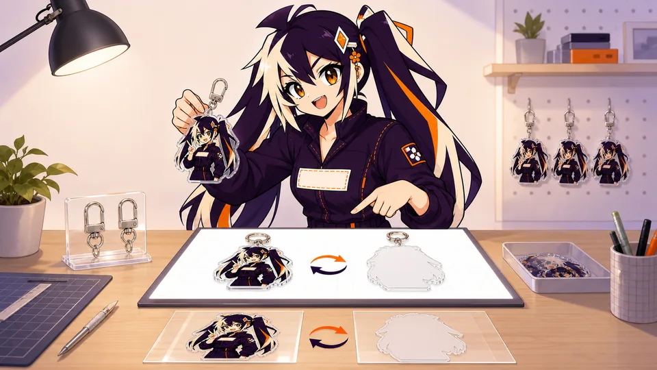
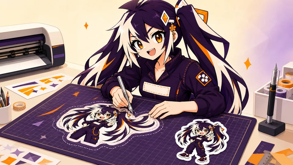
A borderless sticker needs more artwork than the final visible shape. Extending color beyond the intended cut protects the finished edge from tiny white gaps caused by normal cutting tolerance.
Extend background color beyond every finished edge, keep important details inside the safety area and show the intended silhouette without baking an inaccurate factory cut line into the artwork.
01
Key takeaways
Use these decisions to guide the detailed checks below.
- Bleed extends past the finished cut; a border remains visible inside it.
- Keep essential content within the product’s confirmed safe area.
- Continue the background naturally rather than stretching edge pixels.
- Review the complete contour, including tight corners and internal gaps.
- Use current product instructions for numerical allowances.
| Region | Purpose | Common mistake |
|---|---|---|
| Bleed | Continue edge color beyond the cut | Treating it as part of the finished dimensions |
| Safe area | Keep essential content away from the cut | Putting small text on the intended edge |
| Visible border | Create intentional space inside the finished shape | Confusing a decorative outline with a cut guide |
| Cut reference | Communicate the intended physical shape | Accidentally including it in the printed artwork |
02
Bleed is extra image outside the finished edge
The bleed is trimmed away. Continue backgrounds, patterns and gradients into it; do not stretch only the last row of pixels or add an unrelated color ring.
03
Keep important artwork inside the safety area
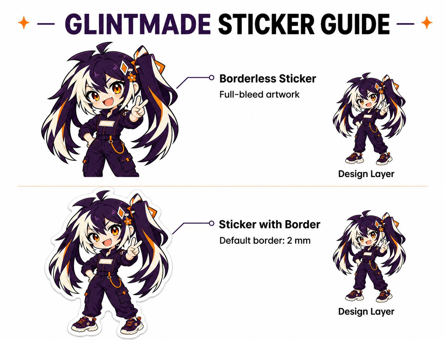
Faces, text and thin outlines should sit away from the intended edge. A full-bleed background can reach the cut while critical content remains protected.
Sort the design into essential and expendable elements. A title, face or identifier may need a safer position than decorative background texture. Do this before choosing the final contour so the shape supports the important information. If a detail sits on the edge for artistic reasons, flag it as an intentional risk to review rather than quietly assuming it will reproduce exactly.
As a hypothetical example, imagine a name placed along a narrow decorative ribbon at the bottom of the sticker. Extending the background below the cut does not move that name into a safer position. Bleed and content safety solve different problems. You may need to move the lettering inward, simplify the ribbon or alter the shape. Compare those design options at actual size before asking for a final proof.
04
Show the silhouette without drawing a decorative outline
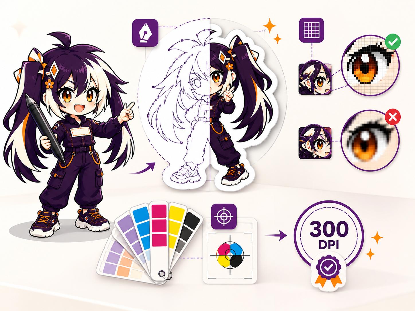
Submit a transparent background and a clear intended shape. Avoid leaving sketch lines or selection borders in the print artwork; the production contour is confirmed in the proof.
05
Simplify fragile points and tight valleys
Hair spikes and narrow gaps can create weak edges or visual chatter. Smooth the contour where complexity is not essential to recognizing the design.
06
Inspect the edge all the way around
At proof stage, trace the entire contour and check that bleed exists everywhere, the artwork is centered and no important feature crosses the safety area.
- View the proof at normal size and enlarged.
- Confirm borderless versus bordered intent.
- Check transparent holes and inner cuts explicitly.
07
Separate bleed, safety and the intended cut
Bleed is extra image that extends beyond the finished edge and is trimmed away. Continue backgrounds, patterns and gradients naturally into that area. Do not create bleed by stretching the last row of pixels or adding a random color ring. Safe area works in the opposite direction: it keeps text, faces and important marks inside the cut so normal production movement does not make them feel cramped or clipped.
A cut guide should communicate the intended silhouette without becoming accidental print artwork. Remove sketch lines, selections and decorative outlines that are not meant to appear. Smooth tiny spikes and narrow valleys when they do not contribute to recognition. Extremely intricate contours can be harder to peel, more vulnerable at the edge and visually noisy at small size.
At proof stage, trace the complete perimeter. Confirm that bleed exists wherever color reaches the edge, critical content stays inside the safe zone and internal openings are intentional. If the sticker should have a border, check its visual consistency while remembering that very thin concentric borders show small registration shifts strongly. If it should be borderless, say so explicitly and compare the proof with the full-bleed artwork.
A die-cut sticker turns one strong silhouette into the finished product. A kiss-cut sticker leaves surrounding backing that makes peeling easier and can carry printed context. A sticker sheet organizes several coordinated designs, while a pack bundles separate pieces for retail or giveaways. Begin with the buyer's action—peel one logo, browse a mini collection, label packages or resell an assortment—then select the format.
Format changes the artwork hierarchy. A die-cut piece needs a readable outer shape. A sheet needs clear spacing, a visual order and enough backing around each cut for fingers. A pack needs pieces that feel related without becoming indistinguishable. Do not force the same file into every format. The hero illustration may work as a die-cut sticker, while its expressions, icons and props become a better sheet.
Specify both the overall product and individual piece sizes. For sheets, record sheet dimensions and the approximate dimensions of each kiss cut. For packs, identify the included designs and count per pack. Review how the format will be photographed and merchandised; backing cards, header areas and packaging labels may need space that is not part of the printable sticker artwork.
08
Design white and effect layers with a clear focal point
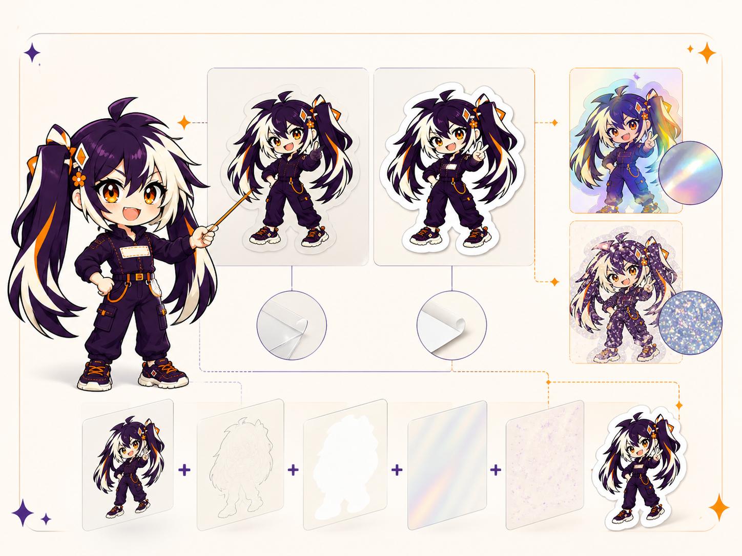
Specialty sticker materials are most effective when the design reveals them selectively. A white layer can keep character colors opaque while unprinted windows show clear, holographic, glitter or metallic material. An effect mask can reserve sparkle for a border, prop, star field or logo accent. Treat these as production layers, not comments floating beside a flattened image.
Use crisp masks and unambiguous names. Show the full-color artwork, the white layer and the effect layer in a review sheet so the relationship is visible without opening the master file. Avoid soft, semi-transparent masks unless the printer has confirmed how gradients are interpreted. On small stickers, simplify effect zones so they remain distinct after cutting and do not turn the entire design into one reflective patch.
Check contrast in different light and over the final application surface. A clear sticker with no white behind dark art may vanish on a dark bottle. A mirror effect can reflect the room rather than read as a stable color. A matte laminate can improve the readability of small type where glare is a concern. When the material effect is the product's selling point, use a sample photograph or short motion clip for merchandising instead of relying solely on a static digital mockup.
Printing, cutting, coating, sewing and assembly all have physical tolerances. The correct response is not to expect zero movement; it is to keep important information away from the areas where small movement becomes visible. Safe zones protect faces and text. Bleed protects edge-to-edge color. Generous material around a hole protects the connection. Clear spacing around a standee slot protects base artwork.
Tolerance becomes more noticeable when a design uses a very thin border, a perfectly concentric ring or a narrow color change at the cut edge. These features turn tiny shifts into obvious visual errors. If that precision is central to the concept, discuss it before quotation and test a sample. Otherwise, widen the border, continue the background color, or make the transition less dependent on exact registration.
Do not hide a tolerance-sensitive feature inside a generic note. Mark it on the art and in the brief, then look for it in the proof and sample. The production team can often suggest a safer construction, but only if the intention is visible early. Good production design accepts the behavior of the process and uses it as a constraint, just as editorial design accounts for trim and responsive web design accounts for different screen sizes.
09
Make the edge review reproducible
Review the artwork twice: once at the full finished size and once close enough to follow the edge. The first view checks whether the composition works; the second checks whether the background continues consistently outside the intended cut. Keep the approved contour visible as a reference layer or separate preview according to the requested workflow, so the reviewer can distinguish it from printed artwork.
Follow the perimeter in a consistent direction rather than looking only at the most prominent face or logo. Inspect corners, narrow projections, internal gaps and places where the background changes color near the edge. A shape that looks smooth at a distance may contain tiny bends or stray points. Mark each required correction with a location or numbered annotation so the next proof can be compared against the same checklist.
After corrections, reopen the exported file and repeat the perimeter check. Changing the silhouette can change the finished width or height and may affect nearby details, even when the center of the artwork is untouched. Record the updated dimensions, contour version and agreed setup instructions together. If an extremely precise visible border remains central to the design, discuss that requirement explicitly rather than assuming a generic borderless instruction covers it.
- Finished size separated from added bleed
- Important details protected inside the agreed safe area
- Background continued around the whole edge
- Cut reference kept distinct from printable artwork
- Revised contour and dimensions approved together
FAQ
Frequently asked questions
Does full bleed mean there is no extra artwork outside the cut?
No. It describes color reaching the finished edge. The background normally needs to continue beyond that edge according to the product’s setup instructions so the intended color can reach the cut.
Can I add a white outline to show the factory where to cut?
Keep the cut reference distinguishable from printable artwork using the requested workflow. A decorative white outline may be interpreted as part of the design. Label the intended finished shape and confirm it in the proof.
How many millimeters of bleed should I add?
Use the current template or production instruction for the exact sticker product. This article does not establish a universal allowance; the requirement may differ with the product and process.
Why are thin borders difficult to judge?
A narrow border makes small changes in the relationship between artwork and cut more visible. Show the intended border clearly and discuss precision-sensitive designs during review instead of assuming every edge will appear identical.
Should I recheck the size after editing the contour?
Yes. The contour defines the final footprint. A shape change can affect width, height, nearby artwork and peeling behavior, so review the dimensions and essential details again before approval.